MANHATTAN PROJECT 2.0
Welcome to the 2nd Manhattan District. This update, you will find, is very much like the previous version, in that the “district” is a dispersed territorial and organizational condition not tied to a specific, contiguous piece of terrain, but rather descriptive of a set of protocols, behaviors, personnel, and information. The original Manhattan District, of course, was primarily located in three places: Los Alamos, NM, Hanford, WA, and Oak Ridge, TN; though the “district” was found wherever (and with whomever) the knowledge of the Manhattan Project traveled.
The 2nd Manhattan Project matches the first in exuberance, ambition, and enormity. This version, however, is concerned equally with digital bits as it is with physical atoms, and it recognizes those two as companions in the 21st Century. The new instance of the Manhattan District is as easily found in your pocket, moving through undersea fiber optic lines, or floating in thin air among us.
This Project is a collection of design research speculating on the past, the present, and the possible futures of Oak Ridge National Laboratory and other Manhattan Project sites, infrastructures, and architectures. Here you will find speculative proposals for ORNL and the larger Oak Ridge Reservation, including three new divisions of the Department of Energy and the architecture and science infrastructure they need. It is organized through 21 agents. Some of these agents are people, some of them are intelligent machines, some are collections, protocols, or behaviors, and some are agencies, bureaus, or institutes.
AREA 51 1/2
A poignant reality of a globalized postmodern public is its access to information from technologies that are constantly measuring and documenting every aspect of the Earth’s surface, making it visible for everyday use. Google Earth is a prime player in the construction of this new reality, allowing the general public to control, via its interface, a seemingly objective and complete view of the Earth’s surface.
What we find when we examine the representational capacities of these technologies more closely, however, is that they in fact expose to a glaring degree the territories of the unknown- those territories in which our technological gaze falls short and our knowledge of those places remains incomplete and uncertain. These territories are manifest as low-resolution pixelations that, even when visible, offer a singular, highly structured perspective that only highlights the missing perspectives that we normally rely on to gather a more complete knowledge of territory.
Thus these territories become blind spots that we can only know (incompletely) through the production of myth and speculative representations: In other words, through the telling of stories and the creation of narrative speculation, the representation of which becomes inextricable from the territory itself.
Drawing on these observations, this work locates itself within the real and imagined territory of Area 51, drawing on the doubt and uncertainty of technological blind spots to offer a productive re-territorialization of place that celebrates, rather than dismissing narrative speculation. Using drawing and model, the work re-represents a territory that not only addresses what is there, but what could and might be there.
THE LIVING MACHINE
Interior Renovation
Mies van der Rohe’s Lafayette Park
Detroit, MI
2012
CART HOUSE
Cart House is a storage container for grocery carts for a local market in Ann Arbor, MI. The goal was to both shelter the carts and patrons and to enliven the space in front of the store. The cart is the one object (other than the groceries themselves) that the customer touches in the store; the Cart House is meant to add as much affect as possible to the otherwise quite banal experience of selecting a shopping cart. The aluminum structure is clad with local Ash wood anywhere the body or a cart comes into contact. The aluminum panels are angled to filter space, light, and vision through the object; each is custom fabricated and unique–responding to the variation in the structure itself.
This was a design-build project where we fabricated the entire project ourselves. The aluminum framed structure is parametric, even though the mixture of tools used slipped in and out of the realm of the digital or computational (mostly various saws and a welder). We worked in between digital models and the object itself by constructing a series of jigs that allowed for variations in the parameters of the elements themselves (like length, angle, etc). In this project there was little distinction between modes of production–digital and analog.
OTHER SPACESUITS
Other Spacesuits claims the Cold-War era Apollo spacesuit as the most exuberant piece of material and cultural production in history, and it also recognizes it as one among many in an ontological genre of self-contained atmospheric envelopes–though some of them no longer resemble 'suits' at all–from the gas mask to the indoor shopping mall to the 24-hour news cycle. This project uses the Apollo spacesuit as a catalyst for work on three architectural, but traditionally separate, discourses: the atmospheric envelope (often the building envelope), making practices (or the methods of design and production), and the aesthetic projects allied with every designed object.
PAMPHLET 34
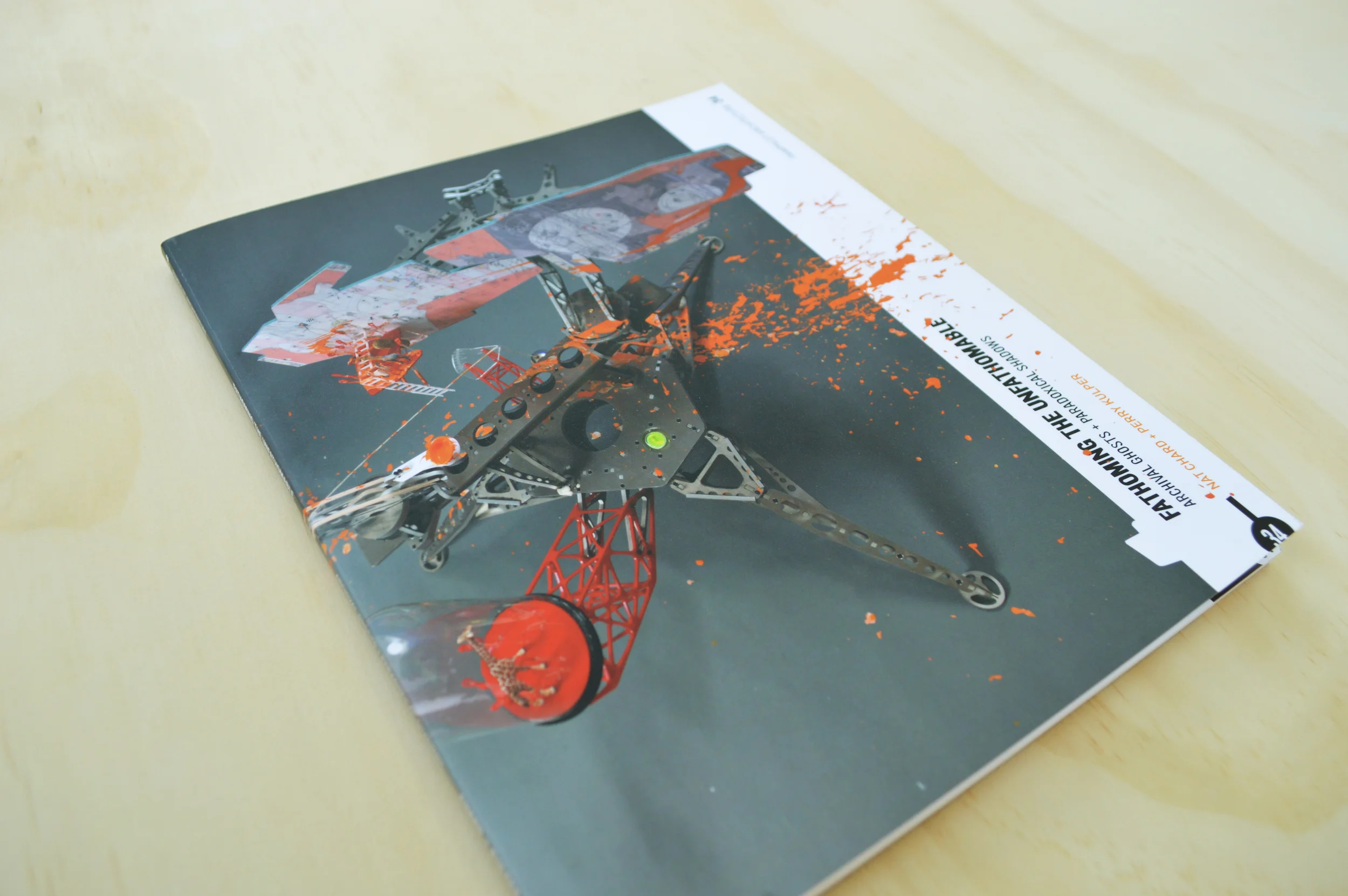
Pamphlet Architecture is a serial publication by Princeton Architectural Press. We were invited by the authors, Perry Kulper and Nat Chard, to design volume no. 34. The authors were synthesizing and producing a third conversation out of an already existing pair they had begun long before. (Or is it alchemy?) With the authors being on different continents and print being the eventual form of dissemination, the graphic design of the book itself needed to help produce the collaboration between them. Relational thinking is also rampant in their work, and the design of Pamphlet 34 brings thoughts and images across and against one another graphically to help immerse the reader in the flavor of the work–letting two, three, or even ten thoughts emerge together all at once. Though our attempts were also aimed at letting the vibrancy of their work (which is already acclaimed) speak for itself without undermining it by overworking the graphics. The graphic design of Pamphlet 34 basically needed to get the conversation started, then get out of the way.
ELECTRIC LOO
(In collaboration with RoTo Architects)
The project is a shipping container conversion to provide male and female bathroom units to a camp in the Angeles National Forest. Each shipping container unit contains three showers, three toilets, and two sinks.
The camp was confronted with new regulations dictating that no new permanent structure could be built. As a result, we used shipping containers to provide a platform of “temporary-ness” that also allowed for the bathrooms to be fabricated off-site, then delivered and installed in a one day period.
The project tries to address disparate internal and external realities: Outwardly the shipping container bathrooms are cooperative with context and landscape, respectfully maintaining small footprints and camouflaged garb. Inwardly they are defiant world-makers, creating their own exuberance through the opportunistic use of materials and detail: Epoxy resin cup sinks and gooseneck faucets are inset into a folded steel countertop, heavy cloth curtains provide material texture and eliminate spatial interruptions, and strategically placed windows allow outward (but not inward) views that capture and frame the landscape, like a painting, appropriating it as an interior moment.
EXTRALEGAL
ExtraLegal is a body of design research that examines the role of surface in defining a relative politics of the interior and exterior, incorporating the logics of digital culture and mass mediation as a means of forging new avenues of investigation and theoretical territories that advance how we think about envelope (skin), façade (face), and enclosure (body).
THE INSTITUTE OF FUTUREOLOGY
The Image is perhaps the most powerful thing in the world. In all it’s manifestations, it has the power to convince us that things happen (or do not happen), to initiate a war, trigger the exchange of capital, destroy consumer (or personal) confidence, underwrite false histories, provide for alternate futures, or put a man on the moon. Living on a globe, most of my relationships are not line-of-sight; they bounce off satellites, they are reflected down fiberoptic cables, or perhaps just imagined in my head. Even in the last ten years, the image (or it’s reproduction rate) has gained speed, gained agency on a near exponential level. Scopic regimes rely on producers of images, fiction-dealers, futurologists, and privilege those who can reproduce their own image, or otherwise have it reproduced for them. Indeed, as Jonathan Crary elaborates, even as early as the 19th Century “a new valuation of visual experience” was taking place, with “unprecedented mobility and exchangeability, abstracted from any founding site or referent.” He posits a kind of “observer-consumer”, where images are exchanged as sure as capital. Debord and Foucault both claim visuality as quintessential, even foundational, in their philosophy, but it is Crary that posits the emergence of ‘the observer’ as a visual subject, who participates in systems of image exchange as a kind of consumption of their own existence in the world, separate from any ‘reality’.
Image, here, is not only as pixels on a page or a screen, but as a wide set of political or socio-visual phenomena, a kind of visuality. But the image (a noun) seats those phenomenal traits of visuality and mass culture firmly within the world of materialization, the world of the architect. The project carries with it five types of image: the public image (celebrity and publicity), the self image (fashion and body composition), the cognitive image (fiction and visual history), the potential image (secrets and latencies), and the situational image (catastrophe and spectacle). Each type cares for the image in a different way.
This project is made of five constituent parts that describe the Institute of Futurology: an Apparatus for Future Communication, an Image Map of the Institute itself, A Uniform (a piece of "deep" clothing), A Fiction (written), and A Situation (a set of catastrophic conditions). These five are descriptions of an Institution that, in the 21st Century is increasingly difficult to render. To produce moments of coherency in the architecture of the Institute, this project produces its "lesser" architectures.
STUDIO 3
We find that the most generic space is also the most sticky- affixing to it the fine details and nuanced conditions of local spontaneous and remote networks of experience. Studio3, a dance and performing arts center in Dexter, Michigan, is an exploration into how space might begin to frame and reconfigure theatrical relationships - through material culture, color, surface, etc- and televisual image culture.
The dance studio is not a passive place of spectatorship, where performer-performed-viewer-viewed are utterly separate and distinguished. Rather, we draw on contemporary image culture where the subject and viewer are often superimposed on one another and form part of an undifferentiated territory of hybrid viewer-performers.
(The performer is not only an object performing for the gaze, but performing as and amongst the digital and analogue gaze simultaneously).
The effect is a series of images layered and superimposed on one another.
Surfaces that reconfigure and transmit image as affective experience.
A performer-spectator space, where parents watch their children learn and perform dance…the studio is a layered series of spaces and surfaces, reflecting, reconfiguring, and transposing images on one another. The generic strip-mall landscape- everywhere America- like a dark television screen asserts is abject placelessness. A storefront for fluid identities and the proliferation of image cultures- Studio3 is a petri dish of performer-spectator subjects, their roles reconfigured, transposed, collapsed, projected through and back out of the space, onto the sidewalk, across the street, to the supermarket, to little bro’s baseball practice, then home for a snack, nap, and a quick t.v. scan of the latest reality. The layering of spaces, virtual and physical projections, transparencies and reflectivity, material and image cultures; they form part of Studio3’s narrative: the relationship of Dance Mom (or Dad) and her (or his) Daughter (or son) within Studio3 itself, but also beyond; bolstering the performativity of the studio spilling outward, into the physical and virtual everyday of those who participate.
The wall that divides the green room and the dance studio conveying wall: one that not only allows for visual associations but also negotiations between performer and spectator, parent and child. The portal frames parent and child alike, mutually constructing performer and spectator in a fluid choreography that changes with conditions of light, sound, and inhabitation. The surface of the portal is transparent with semi-reflective glazing to allow for ones image to be reflected back while being projected through. These projections and reflections meet other glazed surfaces (the storefront windows facing the street, the mirrors in the studio spaces), producing a new image of the interior transposed: performer and spectator, parent and child are superimposed onto one another in a reconfiguration of the roles of each. The entirety of the interior becomes a performed space where the green room is as much a space of performance as the studios themselves, and likewise the studios become a space of spectatorship.
The spaces of Studio3 are not designed to maintain the traditional logics of spectator and performer or their identities. Rather, Studio3 draws on the logics of digital culture and mass mediation to give form to its users. The identity and roles of the user are singular and fixed, but multivalent and mobile: users are networked amongst one another internally, and likewise connected to and affected by digital cultures that permeate their everyday lives.
The surfaces that make up Studio 3 are membranes of conductance: they not only apportion space and programmatically organize, as surfaces tend to do, but they also project and superimpose various forms of identity: those that are of the Studio3 brand, of the studio’s users defined programmatically, and also the digitally networked identities of the users and studio alike.
Relative to the material configurations of Studio 3, children and their parents- as representatives of performers and spectators respectively- are figured and re-figured programmatically and spatially via transparencies and reflectivity (glass and mirrors) outwardly from the streetscape to the interior of the performance and practice spaces.
The entry space becomes a green room literally in its surface treatment and in the sense of being a waiting space that at once provide parents and children a place to gather and wait while also projecting the identity of the studio outward onto the street. Thus the green room becomes a space of holding and projecting mediated by the storefront glazing that defines it as separate from and part of the street.
Likewise, the partial reflectivity of the glazed portal between the green room and the studio spaces allows parents to observe their children as they perform and practice. However, as the portal frames performers, so does it frame the spectator in an oscillating choreography of performer and spectator. The oscillation not only depends on the spatial position of each constituent, but also on the lighting conditions, which cause the glazed portal to reflect, project, and superimpose identities differently in a game of framing and re-framing performer and spectator. As such the portal becomes a mechanism of relational production in which performer and spectator are partially discreet, partially commingled, and always mutually constructed.
The desire is for a material and spatial manifestation that produces a dialogue with both local and globally networked identity formations, with the presumption that users are not isolated events with internally fixed identities, but rather subjects that are oriented both internally and externally relative to physical and digital urban contexts.
PRACTICES AND PEDAGOGIES
Practices and Pedagogies is a collection of works by Perry Kulper. It was designed and self-published in collaboration with the Author in 2012. This was the first comprehensive collection of his works and was in search of a graphic design identity that could support the vibrancy of his drawings. It is a three volume set printed and bound locally in Ann Arbor, MI.
AND
AND magazine ("&") was a student-produced journal co-founded with Mary O'Malley. In 2009, we began producing a serial publication to capture the culture of making in and around the school. Each issue was comprised of a two-sided, single-page document that was folded into a small book format. Readers can trim the edges off the folded document to read it as a pamphlet or simply unfold it to read it as a poster. The graphic design of the book was aimed at accommodating both simultaneously.
DIMENSIONS 22
Dimensions is the annual, student-produced journal of architecture at the University of Michigan. [Mark Stanley was on the design and editorial team for Dimensions 22.] It was designed over the course of an academic year by a group of six students. Students produce the entire journal, including: soliciting work, choosing contributors, organizing content, designing layouts, content editing, copy editing, and completing the proofing and printing process with the press. D22 was printed and bound in Michigan with a run of 1500 copies. The book is organized as a collection of common words and themes culled out of the writing from the various contributors using word counting software tools. The text is then 'strung through' the book as a single line (as well as a series of distinct essays attached to each project). This text appears on the cover as well and is printed with thermally-raised, transparent ink.